Stephen King is an iconic figure in the literary world who has brought to life some of the most unforgettable characters in modern fiction. From Pennywise the Clown to Jack Torrance, his stories have haunted and captivated readers for years. However, King’s influence extends beyond his written works and into the realm of branding, most notably through his logos. In this article, we will explore the symbolism and impact of Stephen King logos, analyzing the iconic author branding that has become synonymous with his name.
King’s logos are not only recognizable but also rich in symbolism, capturing the essence of his narratives and creating a visual identity that is unique to his brand. We will delve into the evolution of his logos, their impact on pop culture, and their role in fostering fan engagement. Through a careful analysis of typography, colors, and design, we will unlock the secrets behind Stephen King’s logos and decode the branding that has made him an enduring name in American literature.
The Evolution of Stephen King’s Logos
Stephen King’s logos have undergone a significant transformation over the years, reflecting different phases in his career and literary style. The evolution of his logos can be traced back to the early days of his career, where he relied on simple typography to convey his author branding.
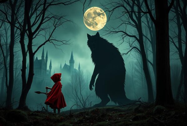
As his popularity grew, he introduced eerie and ominous imagery, such as the infamous red balloon of IT and the eerie stairs of The Shining. These haunting images became synonymous with his works, capturing the essence of his narratives and creating a lasting impact on pop culture.
Through his logos, Stephen King has embodied the shifting styles and themes of his novels, from the horror-centric imagery of his early works to the more nuanced and complex representations of his later career. His logos have always remained relevant, capturing the zeitgeist of each era and appealing to a diverse range of audiences.
The evolution of Stephen King’s logos showcases the versatility and adaptability of his branding, ensuring that it remains a timeless and iconic representation of his literary legacy.
The Symbolism Behind Stephen King’s Logos
Stephen King’s logos are not mere graphics or typography; they represent deeper symbolism that reinforces his literary works’ themes and messages. The logos incorporate elements that evoke specific emotions, creating a visual language that speaks to the readers.
For instance, the logo for his novel “The Shining” has an ominous feel as it includes a maze, which mirrors the book’s storyline that entails a hotel that has a haunted maze. The logo for “The Dark Tower” series conveys a sense of mystery and otherworldliness. The image of a lone cowboy, Roland Deschain, silhouetted against a fiery sky, evokes themes of heroism, sacrifice, and redemption.
Furthermore, his iconic “SK” emblem represents his brand influence in the literary world and the horror genre. The letters are designed to show immense strength and grit. The logo also shows his initials linked together in a symmetrical, circular form reflecting his unique and cohesive author branding for himself.
In conclusion, Stephen King’s logos are carefully crafted to incorporate deeper meanings and symbolism to accurately portray the atmosphere and themes his literature encompasses. These logos have turned into a reflection of his author branding, further drawing readers to resonate with his books.
The Impact of Stephen King’s Logos on Pop Culture
Stephen King’s logos have become ubiquitous in pop culture, leaving an indelible mark on various mediums over the years. From movie adaptations and merchandise to fan communities and Halloween costumes, his author branding has seeped into the subconscious of popular culture.
The Stephen King logos have been featured prominently in movie posters and trailers, serving as an instant hook for his legions of fans and moviegoers alike. The distinctive fonts and chilling imagery have become synonymous with his novels, creating a cohesive visual identity for his works.
Stephen King’s logos have also spawned an array of merchandise, ranging from t-shirts and mugs to phone cases and notebooks. These products not only serve as functional items but also as a form of expression and identification for fans of his novels.
The influence of Stephen King’s logos can also be seen in various fan communities, where they serve as symbols of belonging and solidarity. Fan art, social media groups, and cosplay costumes often feature renditions of his logos, attesting to the enduring power of his brand.
The Role of Typography in Stephen King’s Logos
Typography is a vital element in creating a distinct visual identity for Stephen King’s brand. The choice of fonts and lettering styles in his logos are carefully selected to capture the essence of his novels, whether it’s the playful and eerie font used in It, or the bold and menacing lettering in The Shining.
The typography in Stephen King’s logos is not only visually appealing, but it also adds another layer of meaning to his branding. For example, the font used in the “King” portion of his logo is reminiscent of the vintage typewriter font, evoking a sense of nostalgia and timelessness in his works. Additionally, the use of gothic and horror-inspired lettering in his logos adds to the ambiance of his stories, setting the stage for the supernatural and eerie themes in his books.
Overall, typography plays a crucial role in establishing the visual identity of Stephen King’s brand, adding depth and meaning to his logos while capturing the essence of his novels.
The Colors Behind Stephen King’s Logos
Stephen King logos have a distinctive color palette that complements the eerie and haunting nature of his narratives. Each color is carefully selected to evoke specific emotions and intensify the branding experience.

The use of red in King’s logos signifies danger, aggression, and urgency, echoing the themes of violence and horror prevalent in his work. Blue, on the other hand, creates a sense of calmness, stability, and trustworthiness, often featured in his book covers and movie posters. The use of black further accentuates the fearful and ominous tone, while white symbolizes innocence and purity that are often contrasted against the dark themes of his narratives.
Stephen King’s color palette reflects not only the tone of his writing but also highlights the themes of good versus evil, darkness versus light, and other opposing forces that are featured heavily in his work.
The Influence of Stephen King’s Logos on Book Covers
Stephen King’s logos have become iconic branding symbols that are readily associated with his works. One of the most significant ways in which his logos have affected the literary world is through their influence on book cover designs. His logos have been incorporated into the covers of his books, creating a strong visual identity that immediately identifies the author and his work.
use of Stephen King’s logos on book covers has influenced other authors and publishers to incorporate visual branding into their book designs. From typography choices to color schemes and imagery, Stephen King’s logos have set a precedent for the impact of visual elements in book cover designs.
The Unmistakable Influence of Stephen King’s Logos
The use of Stephen King’s logos on book covers is a hallmark of his marketing strategy, establishing a brand image that is synonymous with his work. The iconic red font on a black background, as seen on the cover of his novel “It,” has become instantly recognizable and is often imitated by other authors and publishers.
The influence of Stephen King’s logos on book covers cannot be overstated. They have played a significant role in the success of his works, as they immediately capture the attention of readers and convey a sense of familiarity. Moreover, they create a sense of unity across his vast body of work, tying together disparate stories and genres through a shared visual identity.
In summary, Stephen King’s logos have had a tremendous impact on book cover designs in the literary world, inspiring other authors and publishers to recognize the importance of visual branding in marketing their works. Their influence on the success of his own works cannot be denied, and his logos remain iconic symbols of his author branding.
Stephen King Logos in Film Adaptations
Stephen King’s logos have expanded beyond the literary world and made their way into the cinematic experience. The author’s branding has become an integral part of the production of film adaptations of his novels, enhancing the promotional material and enriching the overall experience for fans.
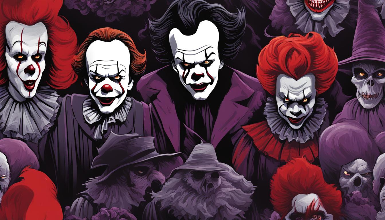
The iconic red balloon from “It” and the eerie silhouette of the car from “Christine” are just two examples of the Stephen King logos that have been incorporated into movie posters, trailers, and promotional materials. These logos not only capture the essence of the story but serve as a recognizable symbol of the author’s brand.
Stephen King logos have become an essential part of the marketing strategy for films based on his works. The logos help to generate buzz and attract an audience that already has a connection to the author and his brand. They also serve as a nod to the devoted fan base that has helped make Stephen King one of the most celebrated authors of our time.
Fan Engagement through Stephen King’s Logos
Stephen King’s logos have become more than just symbols of his author branding; they have created a community of loyal fans. Through their shared identification and belonging to the Stephen King universe, fans have been able to connect worldwide. The use of his logos has fostered a sense of belonging and shared experiences, allowing fans to feel connected to the stories and each other.
The use of Stephen King’s logos has brought people together, from book clubs to fan forums. Fans proudly display their favorite Stephen King logos on T-shirts, bumper stickers, and signage. The iconic branding has even become tattoo art for some of the most dedicated fans.
The shared use of Stephen King’s logos has allowed his work to transcend the pages of the books, connecting readers to each other and the author himself. The community engendered through these logos proves that branding can create more than recognition; it can bring people together.
The Legacy of Stephen King’s Logos
Stephen King’s logos have become an iconic representation of his unique author branding, leaving an indelible legacy in the realm of literature. For decades, the world has associated the chilling imagery and distinctive typography with King’s tales of horror and suspense, creating a strong bond between the author’s brand and his readers.
The legacy of Stephen King’s logos extends beyond the world of literature and has influenced pop culture, cinema, and even fashion. His logos have inspired future authors to create visual identities that capture the essence of their works, illustrating the enduring impact of King’s author branding.
King’s logos have solidified his position as a literary icon, with their imprint on the literary world continuing to inspire fresh generations of readers and horror enthusiasts alike. The Stephen King logos are indeed a testament to the power of visual representation in building an iconic brand, and their legacy will continue to thrive for years to come.
Conclusion
Stephen King’s logos have become a formidable force in the world of author branding, embodying the essence of his literary works and evoking a sense of intrigue among his readers. From the early days of his career to the present, his logos have evolved, reflecting the different phases of his writing journey.
The symbolism embedded within his logos is a testament to the thought and consideration that goes into their creation, hidden messages that convey emotions and connect with readers on a deeper level. The impact of Stephen King’s logos on pop culture is palpable, with their influence being felt across various mediums, from movies to merchandise.
Typography and colors play an essential role in the visual identity of Stephen King’s brand, with each font, lettering style, and color carefully chosen to evoke specific emotions and enhance the overall branding experience. His logos have become synonymous with his book covers, influencing designs in the literary world.
Fan engagement is a vital part of Stephen King’s logos, connecting readers worldwide through shared experiences and a sense of community. Through this engagement, the legacy of his logos continues to thrive, inspiring future authors and leaving an indelible imprint on the literary world.
In conclusion, Stephen King’s logos have become iconic symbols of his brand, embodying his writing journey and connecting with readers on a profound level. The enduring influence of his logos is a testament to their power and the importance of visual representation in creating an unforgettable author brand.